If there’s one thing I learned from technology it is that not everyone have access to the same thing. Not everyone have the same shiny new iPhone XS Max, so the experience when viewing your website will differ from person to person.
It’s quite frustrating when you’ve spent hours constructing the perfect blog post only to realize that your blog post looks broken on a different browser.
I found out the hard way myself when a reader informed me that my website looked completely messed up on their Apple iPad. And that’s why I want to inform you ways to check your website on different browsers, screen resolutions, etc. Without having to spend thousands of dollars to get the different computers, tablets, monitors, and smartphones. Without further ado, let’s get started!
Ps. The tools are not in any particular order.
Tool #1. Browser Shots
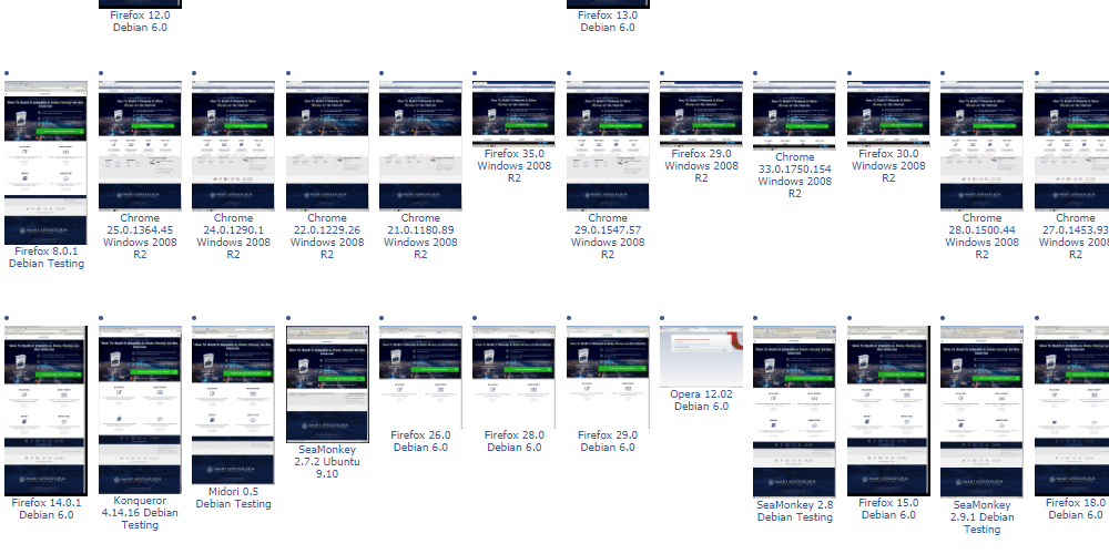
The first online tool I have for you is known as browser shots. It enables you to test your website in different website browsers. It is absolutely free to use, but since it’s free, it will take time for the service to generate the shots for you. Basically, you will be put in a pool of queue and the time depends on how many other people are requesting as well.
The good news is, you can always come back later. Just save the URL or refresh your browser. In the end, it will provide you with results from over 130+ different browsers.
Tool #2. WhatIsMyScreenResolution
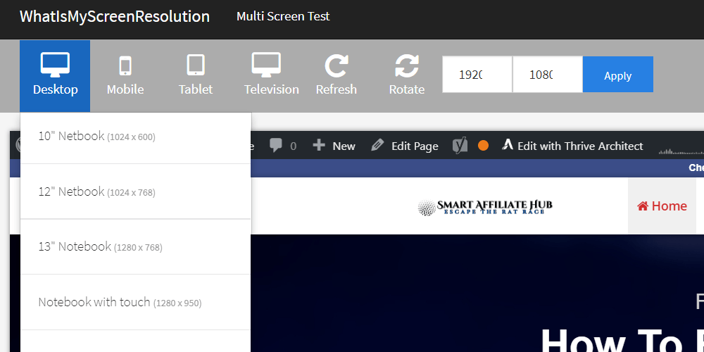
WhatIsMyScreenResolution.net provides you with your current screen resolution as well as the ability to see your website (through URL) on any resolution you desire (check it out here).
For me, I’m using a 1536 x 864 screen resolution. By using WhatIsMyscreenResolution, I am able to see how my website would look on a smaller monitor without having to actually own it. I really like how you can select the type of devices and they even go to the extent of labeling each one.
Tool #3. Mobile Phone Emulator
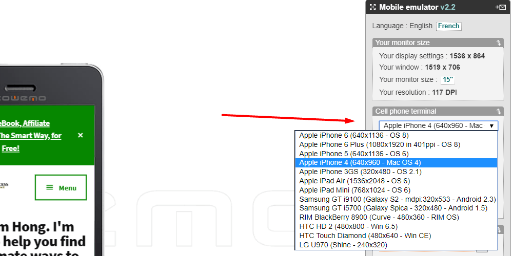
Not going to lie, I really think Mobile Phone Emulator should upgrade their interface. However, it does give you a visual of how your website will look like on set devices.
In Conclusion
With the above tools, you should be able to optimize your website to work for most browsers and screen resolutions in the world. By doing so, you are effectively increasing your earning potentials and search engines will love you even more.
Google and other search engines pay close attention to mobile user-experience since many people now have access to a smartphone or tablet. Unlike the golden years when the only way to access the internet was by using a computer. Now, many people use mobile-devices, so it’s important that you optimize your device to work for everyone!
If you have any questions, comments, or concerns. Please leave a comment down below!
Kind Regards,


 Protected by Patchstack